

Ganttic Reviews & Product Details
Ganttic is a project management software that features a visual interface and visual resource scheduling and project portfolio management features. The various tools you use with Ganttic can be used to plan, strategize, prioritize and optimize your people, plans, and projects seamlessly.

| Capabilities |
|
|---|---|
| Segment |
|
| Deployment | Cloud / SaaS / Web-Based, Mobile Android, Mobile iPad, Mobile iPhone |
| Support | 24/7 (Live rep), Chat, Email/Help Desk, FAQs/Forum, Knowledge Base, Phone Support |
| Training | Documentation |
| Languages | English |

Everything! The system allows us to schedule and manage all our resources efficiently, including instructors classrooms and simulators.
The user interface has frequent changes that take time to get used to, especially for our non technically oriented users.
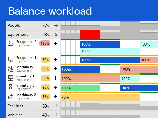
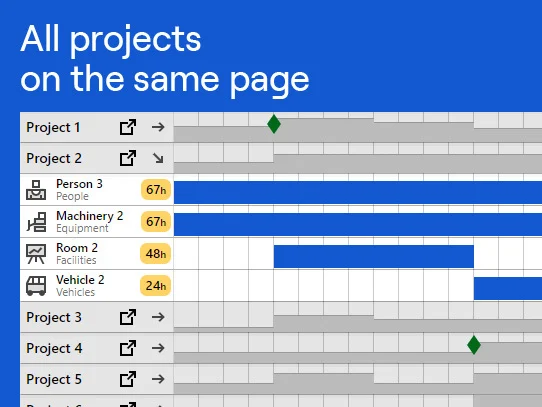
Allows us to see the big picture, schedule multiple resources on various projects concurrently, and prevent schedule clashes
how easy it is to read and navigate the calendar
i don't know what all the widgets do so i sometimes have a hard time finding the actions that i don't use everyday
Making sure the crew has something to do all day and to plan out several weeks for installations. It's great for long term planning
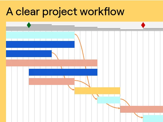
I like best the visual representation of used and unused resource. It's quick and easy to grasp and analyse and it's also quick and easy to make necessary changes.
There could be an option to send out weekly reminders to our department managers to fill in changes in resource usage.
We are managing our engineering and architecture labour resource with Ganttic. It helps us to create a stable workflow and predict our resource openings so the sales department can fill the gaps with targeted sales. Stable workflow means for us less work stress and higher profitability.
I like it the best that I know the Ganttic has security with back ups and my data is safe. I can access it everywhere and it is easy to use.
I kind of miss some zooming possibilities working with Ganttic
Planning of people when working in different projects also connected to their leave/vacation.
Ease of use, once you learn the Ganntic way of doing things. Love how quick I can move from project to project. Edit resources, ear mark resources.
Inability to revert to a previous version. I would like the ability to make a copy of a particular job and then go crazy with edits to see if an idea will work, but am always leary of going too far down the rabbit hole in case I needed to retrace my steps.
Running multiple job site across two different offices across three different jurisdictions or zones. Really nice to be making changes and having counterparts in different locations seeing it as it happens. Also love colour coding, really makes it easy to read.
Ganttic is an easy visual tool for tracking.
Lack of ways I need to see reports and exporting.
Managing our fixed asset fleet.
The drag and drop features. Web based, is nice, works across many platforms.
Sometimes we drag and drop and we'll need to refresh. Not a big deal. It would be great to be able to export a PDF or a view.
We are able to schedule our labor resources.
Interaction with Ganttic is very easy and friendly Perfecto to share resource scheduling in a group
I would like more integration capabilities
Resource scheduling for engineers and consultants
Ability to coordinate multiple resources from a single view and shareable by all.
The ability to toggle between months and weeks is kludgy and confusing. This seems to have changed in a recent release.
We have increased our visibility to team utilization and capacity for new projects.
the collaboration part, we are 4 lead for the same team so we need to plan on the same board
the ergonomic management of the tache the fact that the % of occupation is not visible execpte in the edit view
plan the team with different leader on the same team
Ease of use and being able to see where our employees are and their availability.
When we create new projects there is no simple way to see if we have used that color already.
Scheduling and availability
flexability, Online, history of changing the tasks
Deleted tasks are loosed ... no way to save them somewhere ... maybe in future?
Planning our fleet of busses and minibusses
It is easy to use and shows a graphical view of resources and tasks per week.
I do not have any dislikes at this time since I am new to this software.
We are sharing resources with multiple projects and project managers. Benefits include planning resources for projects.
Ganttic shows me a graphical view of the team members, when they are on each project, and where there are conflicts. At a glance I know where everyone is.
Ganttic does not help me see unfulfilled project needs. For instance, if I know that next month I need to add a developer to Project X, there is no good way to show that missing role. At least, I haven't found a good way.
I schedule team member assignments, making sure all team members are assigned to a project and that all projects are fully staffed.
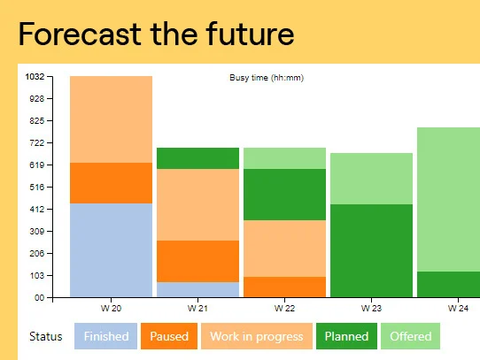
We're able to quickly look ahead at our operations schedule and forecast equipment and personnel availability across our nationwide business.
Sometimes there's a few instances where the website won't take updates until we refresh the page and try again.
Much easier to plan our jobs and get all employees on the same page.
Active tracking of multiple team member workload.
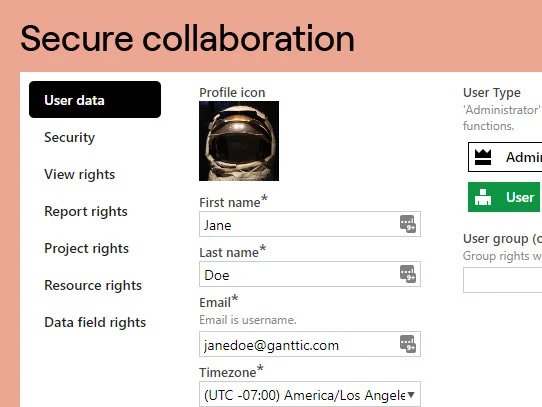
unclear how to set up permissions for new users.
Workload tracking for the entire department.
1. Visual representation of the company's resources - that's exactly what I was looking for when I found Ganttic. 2. Filtering by departments. That feature I found extremely convenient compared with several competitors I also considered.
1. Sometimes there are some glitches as follows: - I can't log in to Ganttic with my Google account so I have to open an anonymous tab and re-log-in which takes additional time and especially that sucks when I'm moderating a meeting (obviously, it causes delays). The other day, it logs in well. - Across different browsers and resolutions, sometimes Ganttic is not full screen in the browser and can't be scrolled properly. It annoys a bit but usually, a simple page refresh helps. 2. Not all managers strive to update Ganttic constantly and that sometimes leads to not up-to-date information. (That's not the problem of Ganttic, but rather the problem is that we use +1 tool in general or a simple human factor :).
We use Ganttic for the company's high-level resource planning by the management. 1. We found the tool very convenient to understand who's doing what on a weekly and daily basis. We don't use it for micromanagement (hourly basis) - for us, a 'task' entity of Ganttic is 'being busy on a project' without any deeper decomposition (for that we use JIRA). 2. It also helps us maintain/revise a sales and recruiting plan for the next months.
Ganttic is a great too to easily and quickly organize and visualize a team of 50+ software developers.
The UI is a bit oldscool but we can work with it which is the most important.
By visualizing the always morphing projects and resources we can make quicker decisions.
The filter and sort function, it can filter by resource, project, country or any other thing that can be individually set up
It would be good if along with the utilisation percentage for the time displayed, there could be also an hourly equivalent shown.
We have been using it to manage resourcing within the team and it has helped a lot. People can go in on their own and check if someone has time available or how long a project is expected to take.
What I like best is that you do not need more than a 5 minute tutorial to get started, unlike some mainstream planning tools from Redmond.....
Not much integration options. lot of people have trouble copy/pasting info to excell and make sense of it (date/time info). If you do that you need to know a thing or two about data types.
People planning on projects, getting a better insight on utilization/capacity on short term period (week-4 weeks)
